Brief Summary

A versatile and user-championing UI/UX Designer and budding Front-end Developer who is always on the lookout for ways to improve and streamline the User journey. I have experience co-founding, managing, designing, developing, and shipping products at an indie video game studio. And I pride myself on delivering well-researched and easy-to-use interface solutions as part of multidisciplinary / cross-functional teams, to the delight of government agencies and enterprise clients alike.
I’ve built my career around creating intuitive, user-focused experiences—from wireframes and high-fidelity mockups to fully developed applications. As both a designer and developer, I’m driven to craft accessible, polished products that exceed user and business goals through collaboration and thoughtful design.
Web Applications
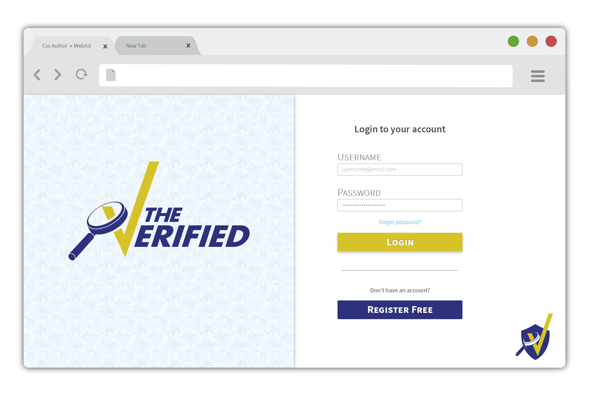
The Verified
A Web App Mock-up of a Credential Verification Platform, for providing a flexible way to verify and manage employee trustworthiness
Read this Case Study
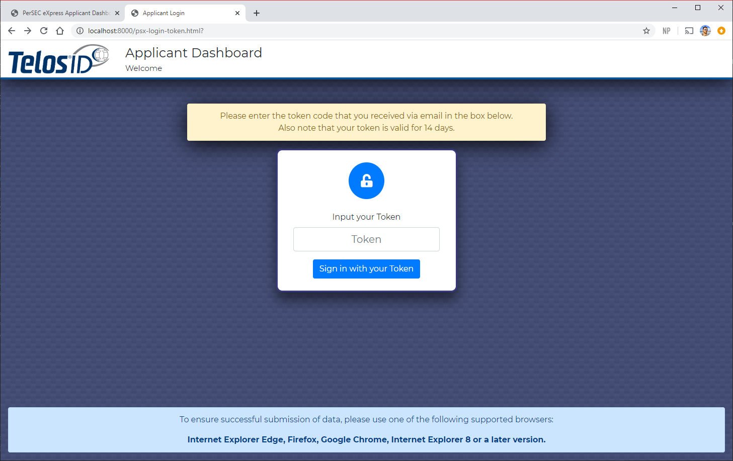
Applicant Dashboard
A Form Wizard for streamlining personnel onboarding workflows across various security-sensitive environments
Read this Case Study
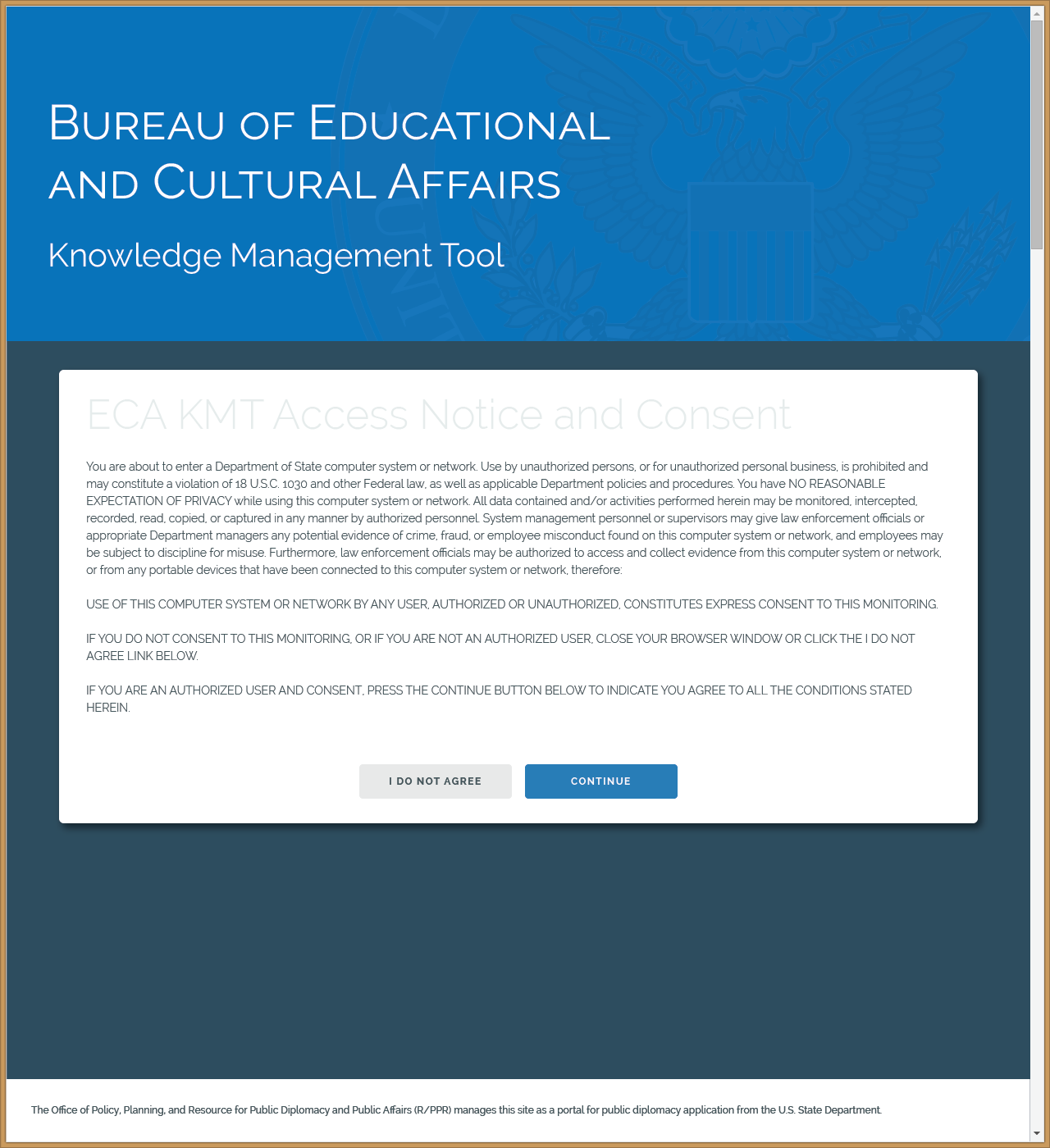
Knowledge Management Tool
A Web App for accessing data, documentation, and participant tracking for the Bureau of Educational and Cultural Affairs
Read this Case Study
Design
Graphics & Advertisements
Vector graphics, Adobe Illustrator
Coffee Cup
Invitation Flyer, feat. Coffee Cup
TheAssociated Centennial Ad
Job Posting - Printed
Full Page Magazine Ad
Convention Floor Banner Ad
Convention Floor Banner Printed
Big Red Button
Data Visualization & Workflows
Vector graphics, Adobe Illustrator
Fortune 500 Client Case Study Data Graphic
Comprehensive Workflow - Risk Management
Benefits of Product - Champion Slide
Upgrade Process Workflow
Third-Party Application Integration Graphic
Branding & Logo work
Vector graphics, Adobe Illustrator, Blender 3D
Variant for Company’s 15th Anniversary
Rebranding of Company’s Flagship Service
Logo Developed for a Service Offering/Product
Logo Developed for a Service Offering
Logo & Stationary Mockup
Banner Variations for an Official Government Blog
Icon, Logo, & Business Card - Holistic Medicine
Icon Detail for the Practice
Anatomical Motions & Animations
Vector graphics, Adobe Illustrator, Blender 3D, Powerpoint
Hands for Duodenum Manipulation
Exaggerated Stomach Motility
Exaggerated Liver Motility
Gallbladder PPT Animation
Unhappy Gallbladder
Games & Art
co.llide - Online Battle Arena Game
co.llide Logo
First Pass UI Mockup
Vector Mockup Adobe Illustrator
Vector Mockup w/ Social Overlay
High Fidelity Mockup - Web App
Ship Builder
(Older Interface)
Online Gameplay (Older Interface)
Destructible Ships!
Nyx - Mobile Puzzle Game
co.llide Logo
Chase away the sun to begin the Night
Give Chase - Pursue the Target
Captured!
High Score Screen
Beat levels to unlock more
Concept Art
co.llide Logo
Mascot
Reaper
Mercantile Faction Concept
Infinitely Scrolling Pinball Game
Alternative Theme for Pinball Game
Brief Summary
A versatile and user-championing UI/UX Designer and budding Front-end Developer who is always on the lookout for ways to improve and streamline the User journey. I have experience co-founding, managing, designing, developing, and shipping products at an indie video game studio. And I pride myself on delivering well-researched and easy-to-use interface solutions as part of multidisciplinary / cross-functional teams, to the delight of government agencies and enterprise clients alike.
I’ve built my career around creating intuitive, user-focused experiences—from wireframes and high-fidelity mockups to fully developed applications. As both a designer and developer, I’m driven to craft accessible, polished products that exceed user and business goals through collaboration and thoughtful design.
Web Applications
The Verified
A Web App Mock-up of a Credential Verification Platform, for providing a flexible way to verify and manage employee trustworthiness
Read this Case Study
Applicant Dashboard
A Form Wizard for streamlining personnel onboarding workflows across various security-sensitive environments
Read this Case Study
Knowledge Management Tool
A Web App for accessing data, documentation, and participant tracking for the Bureau of Educational and Cultural Affairs
Read this Case Study
Design
Graphics & Advertisements
Vector graphics, Adobe Illustrator
Coffee Cup
Invitation Flyer, feat. Coffee Cup
TheAssociated Centennial Ad
Job Posting - Printed
Full Page Magazine Ad
Convention Floor Banner Ad
Convention Floor Banner Printed
Big Red Button
Data Visualization & Workflows
Vector graphics, Adobe Illustrator
Fortune 500 Client Case Study Data Graphic
Comprehensive Workflow - Risk Management
Benefits of Product - Champion Slide
Upgrade Process Workflow
Third-Party Application Integration Graphic
Branding & Logo work
Vector graphics, Adobe Illustrator, Blender 3D
Variant for Company’s 15th Anniversary
Rebranding of Company’s Flagship Service
Logo Developed for a Service Offering/Product
Logo Developed for a Service Offering
Logo & Stationary Mockup
Banner Variations for an Official Government Blog
Icon, Logo, & Business Card - Holistic Medicine
Icon Detail for the Practice
Anatomical Motions & Animations
Vector graphics, Adobe Illustrator, Blender 3D, Powerpoint
Hands for Duodenum Manipulation
Exaggerated Motility Stomach
Exaggerated Motility Liver
Gallbladder PPT Animation
Unhappy Gallbladder
Games & Art
co.llide - Online Battle Arena Game
co.llide Logo
First Pass UI Mockup
Vector Mockup Adobe Illustrator
Vector Mockup w/ Social Overlay
High Fidelity Mockup - Web App
Ship Builder
(Older Interface)
Online Gameplay (Older Interface)
Destructible Ships!
Official Launch
Nyx - Mobile Puzzle Game
Promotional Image
Chase away the sun to begin the Night
Give Chase - Pursue the Target
Captured!
High Score Screen
Beat levels to unlock more
Concept Art
Vehicle-based Voxel Battle Arena Concept
Mascot
Reaper
Mercantile Faction Concept
Infinitely Scrolling Pinball Game
Alternative Theme for Pinball Game